Talk:Main Page
We've had some problems with vandalism on the talk page here. For now, only registered users can leave comments here. If you have a question to ask, feel free to create an account, it's fast, easy, fun and free. Or, if you have questions, you can always ask our administrators, Zoey, Jonpro, Phoenician, and FH14.
Contents
- 1 Talk Archive for Main Page
- 2 Navigation menu
- 3 Breeniverse Timeline
- 4 Sarah and Taylor
- 5 Swap Taylor and Sarah
- 6 Jonas' Picture
- 7 Adding Spencer, changing sizes.
- 8 Adding on to the navigation
- 9 This is Probably Just Stupid But...
- 10 Why is there something on the main page nere the bottom for...
- 11 New Featured Article
- 12 Lonelygirl15 Portal image
- 13 beta.lonelygirl15.com
- 14 Missions and Relationships
- 15 How about?
- 16 New Series Portal Images
- 17 One Year of LGPedia
- 18 Featured Content
- 19 New portal images?
- 20 The Last Work
- 21 The End
- 22 the resistance/The Resistance
- 23 The Resistance portal image?
- 24 Thin?
- 25 Main Page redesign(?)
Talk Archive for Main Page
- Archive up to November 2006
- Archive from November up to December 2006
- Archive from December up to January 2006
- Archive of redesign discussion
- Archive of final redesign discussion
- Talk:Main Page/Archive from Jan-Feb2007
- Talk:Main Page/Archive of character box discussion
- Talk:Main Page/Archive_March-Mid_May
How about with colors?

|

|

|
| Bree | Daniel | Jonas |
- Hurrah for colors! I love this so much. silverX3 08:46, 13 May 2007 (CDT)
- I definitely prefer it without the colors. Too many clashing colors is never good design. --JayHenry 09:15, 13 May 2007 (CDT)
- The colors are nice and I like how they match up with the colors id'ing the bloggers on the right side of the page. If you look at the new box along with the rest of the main page, it works. Malan89 22:08, 13 May 2007 (CDT)
- I agree with Malan89 the whole way. Live? silverX3 16:22, 15 May 2007 (CDT)
- I really think it looks bad. Those aren't even the same colors as the initials. They don't match at all. --JayHenry 16:27, 15 May 2007 (CDT)
- Don't worry about it for now. I think we may be adding a "Taylor" block soon. Malan89 20:32, 17 May 2007 (CDT)
- Please no colors, I'm serious. The Main Page really doesn't need to be tricked out. It has a simple color scheme that works great, and it has some pictures and color accents (like in the Init template) to keep things just interesting enough. I'm actually not a fan of the colored boxes on the characters page either, but if you want to have a little fun with that, fine by me, just leave the main page as is, it looks much more polished and put together without the rainbow of fruity flavors. Like Malan said, perhaps we should be more concerned with whether to add Taylor, Sarah, or Taylor&Sarah together to the Main block. They've already done their first "official" blog on their own, on the left-hand column. Quite the milestone for them. OwenIsCool 21:27, 17 May 2007 (CDT)
- I'm ok with addeing them, but i think we should wait till it's certain they are going to last beyond this story arc, same thing for Jules. -misty 15:43, 18 May 2007 (CDT)
- Please no colors, I'm serious. The Main Page really doesn't need to be tricked out. It has a simple color scheme that works great, and it has some pictures and color accents (like in the Init template) to keep things just interesting enough. I'm actually not a fan of the colored boxes on the characters page either, but if you want to have a little fun with that, fine by me, just leave the main page as is, it looks much more polished and put together without the rainbow of fruity flavors. Like Malan said, perhaps we should be more concerned with whether to add Taylor, Sarah, or Taylor&Sarah together to the Main block. They've already done their first "official" blog on their own, on the left-hand column. Quite the milestone for them. OwenIsCool 21:27, 17 May 2007 (CDT)
- Don't worry about it for now. I think we may be adding a "Taylor" block soon. Malan89 20:32, 17 May 2007 (CDT)
- I agree. Everyone thought Alex was going to be a main character (and she still could be recurring) but we haven't seen her in ages. Let's be patient with with Taylor, Sarah, and Jules --Pheon 20:58, 23 May 2007 (CDT)
Why do we need a link to this page on the navigation menu on the left? Again, it just forces down the search box with no improvement to the utility of LGPedia. There are already simple ways for getting back here so this link is just a total waste and very annoying because it leads to more scrolling than is desired.--modelmotion 20:58, 8 April 2009 (CDT)
Breeniverse Timeline
Now that the Breeniverse Timeline has been cleaned up and brought up to date, we should add it to the main page -misty 15:38, 18 May 2007 (CDT)
- The Breeniverse Timeline has been cleaned up? Finally? I GOTTA GO CHECK THAT OUT! *hops away giddily* silverX3 16:56, 18 May 2007 (CDT)
Sarah and Taylor
Okay, now that Sarah and Taylor have both posted their own video blogs that have been posted on the main site, I think it's reasonable to add them to the main page. I mean, if they don't end up lasting past this arc, we can always remove them. They just seem significant enough at this point to merit a front-page character box. Thoughts? --Zoey 22:37, 30 May 2007 (CDT)
- I agree with putting them up. The Creators are obviously doing a thorough job trying to fill out these characters with their personalities, their relationships, and their parental issues, so I think they'll be up for awhile. I didn't expect Sarah to actually POST anything outside of a Myspace Blog so soon, but I stand corrected. --Pheon 11:37, 31 May 2007 (CDT)
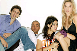
Okay, I went through and found some good images of Sarah and Taylor. They will probably need to be cropped better to match up with the other characters, but I wanted to get some options up. What do people think (I like Taylor 1 and Sarah 3, personally)?

|

|

|

|

|
| Sarah 1 | Sarah 2 | Sarah 3 | Sarah 4 | Sarah 5 |

|

|

|
| Taylor 1 | Taylor 2 | Taylor 3 |
--Zoey 14:20, 31 May 2007 (CDT)
I like Taylor 1 as well (very Secret Agent-y . . . don't ask). But I'm stuck between Sarah 1,3, AND 5. 1 just seems to have that Sarah-randomn-quality to it, 3 (besides the obvious) is from her first v-blog, and 5 matches up with her profile (currently). So I'm stuck on Sarah. --Pheon 15:35, 31 May 2007 (CDT)
I like Taylor 1 and Sarah 3. Taylor 2 and Sarah 5 are also good. --XAccordianGuyx 19:51, 31 May 2007 (CDT)
- I like Taylor 1 and Sarah 3 as well. The other two Taylor photos are also good in that... well, that room is where you usually see her. But I stand T1 and S3. I'm glad we're adding them to the front page. --Chartreuse 20:33, 31 May 2007 (CDT)
Okay, it seems like T1 and S3 are the consensus? Can anyone crop them so that their heads are the same size as the other chars on the front page? Oh and also...
|
|
|
|
|
|
| Bree | Daniel | Jonas | Taylor | Sarah |
OR
|
|
|
|
| Bree | Daniel | Jonas |
|
|
|
| Taylor | Sarah |
OR um, yeah. How should we handle the alignment with five chars? --Zoey 20:47, 31 May 2007 (CDT)
- Here's a go at front-page quality images. They look bad full size, but I adjusted the face sizing and the saturation (only on Taylor's because it looked so bland between Jonas and Sarah).
|
|
|
|

|

|
| Bree | Daniel | Jonas | Taylor | Sarah |
- I guess that looks a little more consistent? Just trying to help. --Chartreuse 22:08, 31 May 2007 (CDT)
- I'm loving this group of five! So . . . on the alignment,I would prefer upside-down pyramid, if it's not too hard (The codes above look nightmare-ish). It just looks like a horizontal band of five characters would just be too long. --Pheon 02:43, 1 June 2007 (CDT)
I feel like the Sarah pic needs to be SLIGHTLY zoomed in more to make her face size more consistant with the rest. I hope thats not too big a problem. Oh, and maybe she should be desaturated.. shes like.. noticably brighter than everyone else... But basically, other than that, are we good to go?
|
|
|
|
| Bree | Daniel | Jonas |
|
|
|
| Taylor | Sarah |
Here's what I've got based on the current consesus. Like I said, I think Sarah's head should overall be larger to match with the rest of the chars but yeah. Oh, and I iike the saturation on Taylor. Yay, I can't wait for this to go live :D --Zoey 02:50, 1 June 2007 (CDT)
- Alright, I resized and recropped Sarah, desaturated and darkened her just the slightest bit (sorry, boys, had to crop the cleavage), so I think she fits in a bit more now. Also, I tweaked the previous code so that the border between Taylor and Sarah is only 1 pixel instead of two. I do like the pyramid... it kind of gives the feel of them being secondary main characters. Plus, it won't stretch things in lower resolutions. --Chartreuse 20:32, 1 June 2007 (CDT)
|
|
|
|
|
|
| Bree | Daniel | Jonas | Taylor | Sarah |
- The only problem with this is that it's going to look awful on lower resolutions. It'll stretch things all out of whack. I think the most characters you can have side-by-side is going to be four. It really is a shame we don't have one more character to try and balance the pyramid out. --Chartreuse 01:02, 2 June 2007 (CDT)
I REALLY like the way it looks. However, the two columns on the Main Page are now very uneven. For this, I have a suggestion... how about we list the last 5 videos with thumbnails and descriptions, as opposed to 4? It's more consistent with the 5 "previous videos," and it will make the page look much more balanced. Y/N? ~ Jbshryne 23:30, 1 June 2007 (CDT)
- I was actually thinking the same, but I thought, 'Hmmm . . . better let someone else bring it up first' --Pheon 23:55, 1 June 2007 (CDT)
I do actually kind of like the smaller images lined up in one row, but I still worry about what it will do to the page with smaller resolutions. Does anyone with a smaller resolution want to check this out maybe? --Zoey 02:23, 2 June 2007 (CDT)
- in 1024X768 it looks great with 90px images but we can also reduce down to 80px images too. none of the formatted pages look good at 800x600, but I don't think we need to worry about that, since almost no one has a 13 inch monitor anymore. -misty 03:25, 2 June 2007 (CDT)
- without objection I will change the page 12 hours from now. -misty 03:25, 2 June 2007 (CDT)
- Sounds great to me. No objections here. --Chartreuse 12:33, 2 June 2007 (CDT)
- without objection I will change the page 12 hours from now. -misty 03:25, 2 June 2007 (CDT)
Swap Taylor and Sarah
I noticed that FH14 just switched Taylor's and Sarah's boxes. I assume this is because Sarah is getting a bigger role now than Taylor? I reverted the change so it could be discussed and also because the borders didn't look quite right. If people want the pictures swapped, just offer your support here and we'll go ahead and do it. As a general rule, though, the Main Page shouldn't be changed without first getting consensus as it is the most viewed page on the 'pedia.--Jonpro 16:58, 7 June 2007 (CDT)
- I agree that Sarah's become a more important character (thank god!), so she should be first. ~ Jbshryne 13:47, 9 June 2007 (CDT)
- I also agree. It would make sense, seeing as it seems as though Taylor has faded out of the picture. --Bxman 18:45, 9 June 2007 (CDT)
- Okay, I went ahead and changed it. Thanks for the input, Jbshryne and Brooklynxman!--Jonpro 22:11, 9 June 2007 (CDT)
Jonas' Picture


Is it at all possible for Jonas' picture to be sharper? Otherwise, I think we should replace it. I do have another picture in mind. I remember the discussion of picture changes a month or so ago, but I think his picture needs to be either sharper or changed. I'd like to hear everyone's opinion. Chelseyrl 20:16, 7 June 2007 (CDT)
- I agree. I always thought the picture wasn't sharp enough. I would love to see the picture you had in mind.--jeans
- I concur, and besides, that picture isn't doing justice to his looks. --truncatedslinky 21:34, 7 June 2007 (CDT)
- I like jonasdontticke.jpg (the left image)!!! If you need it cropped/adjusted, let me know. --Chartreuse 23:01, 7 June 2007 (CDT)
- I concur, and besides, that picture isn't doing justice to his looks. --truncatedslinky 21:34, 7 June 2007 (CDT)
Oh, me! :P I vote yes! I really like the left picture :) --Zoey 21:20, 9 June 2007 (CDT)
- As do I. I just don't know how to change it on the main page. So can we go through with it?Chelseyrl 21:21, 9 June 2007 (CDT)
- Someone will need to crop it so that it matches the size/ratio formats of the current images, and then it can be added. Once it's modified I can add it if ya want :P. That's not a problem. We just need to get it looking right! --Zoey 21:24, 9 June 2007 (CDT)
- I'd crop it... but I have no idea what the current size/ratio format is. Chelseyrl 21:25, 9 June 2007 (CDT)
- I cropped it to the size, but perhaps not to the ratio. If it's wrong, revert it. ~ JBSHRYNE 01:44, 10 June 2007 (CDT)
- Yeah, his face was too big. Grr. I'll try again... in photoshop. ~ JBSHRYNE 01:46, 10 June 2007 (CDT)
- Um... you know what? Bad news. There might not be enough "picture" around Jonas's face in that shot (even in the original video) to use that picture, because everybody else's faces are smaller in their pictures, in comparison to their "backgrounds." :-( ~ JBSHRYNE 01:54, 10 June 2007 (CDT)
- Yeah, I just tried to play with it... and you can get it to the same size and shape, but his face is way too close to the camera to bring it out and make him match the rest of them. I rewatched that same video to look for a place where there could have been a more usable screenshot, but to no avail. I'm going to go through some recent videos to look for a good screenshot. --Chartreuse 09:28, 10 June 2007 (CDT)
- You know, how do we feel about a shot from The Morning After? Just looking at the thumbnail that's on the page right now, it looks like the size/ratio would pretty much match up perfectly with the others. The only problems I can see: (1) we would probably want to wait through a few more videos, so we don't have 2 shots from the same video on the Main Page, and (2) he's kind of half-naked (though that might be less of a problem for some than for others...) ~ JBSHRYNE 17:35, 10 June 2007 (CDT)
- Yeah, I just tried to play with it... and you can get it to the same size and shape, but his face is way too close to the camera to bring it out and make him match the rest of them. I rewatched that same video to look for a place where there could have been a more usable screenshot, but to no avail. I'm going to go through some recent videos to look for a good screenshot. --Chartreuse 09:28, 10 June 2007 (CDT)
- Um... you know what? Bad news. There might not be enough "picture" around Jonas's face in that shot (even in the original video) to use that picture, because everybody else's faces are smaller in their pictures, in comparison to their "backgrounds." :-( ~ JBSHRYNE 01:54, 10 June 2007 (CDT)
- I'd crop it... but I have no idea what the current size/ratio format is. Chelseyrl 21:25, 9 June 2007 (CDT)
- Someone will need to crop it so that it matches the size/ratio formats of the current images, and then it can be added. Once it's modified I can add it if ya want :P. That's not a problem. We just need to get it looking right! --Zoey 21:24, 9 June 2007 (CDT)

It may be difficult to find a good picture of Jonas where the camera is sufficiently distant from his face. See below for 5 pictures of Jonas: the current pic, the current pic sharpened, and 3 new pics from the latest video. However, when you put one of the new pics alongside the other characters, you can see that Jonas's face is too close to the camera. So far, I vote to use the sharpened version of the current pic unless someone can upload some more alternatives (or point me to the relevant video and scene for more photo ideas). Psmith 09:37, 11 June 2007 (CDT)
|
|

|

|

|

|
| Jonas 1 | Jonas 2 | Jonas 3 | Jonas 4 | Jonas 5 |
|
|
|
|
|
|
| Bree | Daniel | Jonas | Sarah | Taylor |
|
|
|
|
|
|
| Bree | Daniel | Jonas | Sarah | Taylor |
Haha, those three new ones actually kind of scare me. I vote for the sharpened current one too. --Zoey 11:38, 11 June 2007 (CDT)
- Man... why does that pic from Bedside Manner have to be too big?? Yeah, I agree, the sharpened current is already a huge improvement. The Creators had better give us a nice shot of him soon, from far enough away... ~ JBSHRYNE 16:45, 11 June 2007 (CDT)
- I agree, the sharpened version of the current picture is WAY cool.--jeans
- I also agree, but it is higher in contrast and saturation than the others, I think that it should be the benchmark and the others should be matched to it since all of them are a little too dull. -misty 01:29, 12 June 2007 (CDT)
- I also enjoy seeing a clearer version of the current picture of Jonas. Keep the same shot, just pick the clearer one! --Pheon 01:48, 12 June 2007 (CDT)
- I love the sharper version. Great job whoever did it! Chelseyrl 23:06, 12 June 2007 (CDT)
- OK, it looks like you all like the sharpened version so I'll go ahead and update the main page. Misty, I'll look at adjusting the sharpness of the other headshots too, but I'll post them here first. Psmith 09:39, 13 June 2007 (CDT)
- I love the sharper version. Great job whoever did it! Chelseyrl 23:06, 12 June 2007 (CDT)

I'm going to just throw another headshot out there and see if anyone likes it better than the current one. It obviously would still need to be properly cropped and sized.--jeans July 11
- I love this! I was actually thinking "he looks so nice" as I was watching this video today. --Chartreuse 15:36, 11 July 2007 (CDT)
Adding Spencer, changing sizes.
Because it has been announced that Spencer will be with us as a series regular for at least the next two months, should we add him to the front page? If we do, we'll have to change the sizes of the character images because five on the top and one on the bottom would look kind of cluttered. Love, -R- 18:10, 10 July 2007 (CDT)
(EDIT: we could also make the sizes bigger to make it three on the top, three on the bottom) Love, -R- 18:12, 10 July 2007 (CDT)
- I had been playing with that earlier today, actually! My Sandbox --Chartreuse 18:15, 10 July 2007 (CDT)
- Oh, I see! I'm glad you're working with it! Love, -R- 18:20, 10 July 2007 (CDT)
- Any feedback would be lovely. This is what I have at this point:
|
|
|
|
| Bree | Daniel | Jonas |
|
|
|

|
| Taylor | Sarah | Spencer |
- i like that. 5 across was looking a little long to me, actually --Milowent 07:54, 11 July 2007 (CDT)
I think it's a fine idea, and it looks good, but I propose we wait to make any changes until we make the whole Portal pages live, just so we don't overcomplicate things. *nods* --Zoey 18:40, 10 July 2007 (CDT)
- Oh, that's what I had figured on, which is why it was just on my sandbox page for now. I just had Photoshop open at the same time as Spencer's latest, so I was like... HMMM... *nods back* --Chartreuse 18:46, 10 July 2007 (CDT)
- Okay awesome :) Ooh, hey, if you've still got PS open, someone needs to crop the images on User:Zoey/sandbox to make them fit in the boxes properly. It might involve cropping.. or adding like.. a white background or something.. I dont know, whatever to make it look good. But yeah, just a though, especially if you have PS opened already :) Thanks. --Zoey 18:50, 10 July 2007 (CDT)
- O.O! I refuse to admit to the fact that I had already been messing with them. Scary! --Chartreuse 18:55, 10 July 2007 (CDT)


The LG one looks good, but does the KM one look slightly fuzzy to anyone else? Is that fixable? Gah, I hope we get the "new" cast photos Miles promised soon, I don't like how these two are so vastly different in sizes with the people (the Kate cast is so BIG compared to the LG cast! Haha). Other than that though, I think it's good. Anyone else have any thoughts? --Zoey 20:25, 10 July 2007 (CDT)
- With the KM one, it was already fuzzy. That is the sharpened version, but I'll sharpen it a bit more. Love, -R- 20:26, 10 July 2007 (CDT)
- OK, hows this:
- It's increased a little bit. Love, -R- 20:32, 10 July 2007 (CDT)

- (Ooops, wrong size (and I airbrushed a little bit.) Here:

- Hows that?) Love, -R- 20:37, 10 July 2007 (CDT)

- Those look nice. Only thing I recommend (if possible) is sharpening around Gavin's head and Kate's head. Otherwise it's a vast improvement. Chelseyrl 00:58, 12 July 2007 (CDT)

Whoever has access to edit the navigation bar on the side will soon need to add the KM and LG portals on. This will be more convenient for editors and users to navigate between the shows. Just bringing this to attention. Love, -R- 22:01, 14 July 2007 (CDT)
- I think that the Portal links should be at the top. So it would go Portal, Videos, Forums, List of Videos. I think it makes more sense considering we're at the 'pedia, so the Portal should be first. Chelseyrl 13:51, 25 July 2007 (CDT)
- Yeah, I agree with Chelsey. I'd fix it but I gave up my sysop rights! :*( Anybody who has sysop access can change the sidebar here: MediaWiki:Sidebar.--JayHenry 16:40, 25 July 2007 (CDT)
- Done! (I was wondering about that too . . .) :) --Pheon 16:48, 25 July 2007 (CDT)
This is Probably Just Stupid But...
...The main page, i like it but for some reason i don't think it looks wiki like. It is cool but needs to look more like a wiki. But my opinion is just an opinion.
- Well, in my opinion, you're wrong :P
- Seriously, though, pick any other skin, and the old main page looks different as well. Just because wikipedia has a certain design doesn't make that the ultimate "wiki" design. There are dozens of skins for the MediaWiki software alone, and dozens of other wiki softwares as well. Look at MemoryAlpha:Main Page - they're using the same software both Wikipedia and LGPedia use - yet they look totally different.
- We acknowledge your wish to have the main page look more like a generic wikipedia clone, but I, personally, do not support it :P
Why is there something on the main page nere the bottom for...
lonelygirl15, it has the creators, and the "universe". if there was that shouldn't katemodern have one or should the lonelygirl15 one be taken off--Houdini 15:22, 27 July 2007 (CDT)
- The 'Universe' encompases both the stories of Kate & Bree, Houdini. They simply call it the LG15 Universe, becuase, well, LG15 came first. --Pheon 15:39, 27 July 2007 (CDT)
New Featured Article
should there be a new featured article?--Houdini 02:15, 29 July 2007 (CDT)
I believe so, It has been up there for a while.
--Michiev 20:19, 6 August 2007 (CDT)
Lonelygirl15 Portal image
Eventually do you think that the portal image for lonelygirl should be changed to reflect the fact that bree is no longer?
Im not saying anyone has to, im just throwing an idea out in the air.
beta.lonelygirl15.com
So I see that www.lg15.com/lgpedia has been moved to beta.lonelygirl15.com/lgpedia. If anyone could fix any broken links on Wikipedia, that'd be great! I'll get to work on it, but I see some of the links are still at lonelygirl15.com/lgpedia, which as we know, is broken. Bye guys! •Silver• Talk | Contribs 20:18, 8 August 2007 (CDT)
- I'm sorry, but I don't even see what youre talking about? LGPedia links show up for me at lg15.com/lgpedia --Zoey 23:38, 8 August 2007 (CDT)
- For a short while, Zoey, the LGPedia was relocated beta.lonelygirl15.com/lgpedia. It seems that it has been moved back to lg15.com/lgpedia, though.
Missions and Relationships
Should i move missions and relationships to the main page.--Houdini 17:43, 13 August 2007 (CDT)
- I'd say that it's a good idea to move Missions and Relationships to the Main Page. :) Go for it, Houdini! •Silver• Talk | Contribs 01:55, 16 August 2007 (CDT)
- Well I'm not sure about Missions, but I think Relationships should be seperate for each series, as the page is already long enough as it is. --Zoey 02:03, 16 August 2007 (CDT)
- Hmmm, Missions could work for the Main page, as it currently has both series in that article. I do agree with Zoey however, that Relationships would be fine with their respective Portal. --Pheon 02:18, 16 August 2007 (CDT)
How about?
How about each month we change it to a charector theme? But I dont think thats a very good idea.
New Series Portal Images
Well, with all of the new logos... well now so new anymore... I believe it is past due for a little change. I made a portal image for LG15 first:

I want to get feedback before I make the KateModern image, because that will take a little more work and I don't want to waist my time. Feel free to comment, I personally don't like the way it ways "portal," and need help on what it should look like. Love, Randy (Say Wha'? | Whachu Doin'?) [Sept. 09, '07 - 8:26 PM, Central Daylight]
- You couldn't copy my response too, Randy?? :P (Anyways, I think it looks good, and I would suggest having the "Portal" go diagonal-like like the rest of the logo, if possible. -- 18:29, 9 September 2007 (CDT)) Pheon 21:23, 11 September 2007 (CDT)
- Caaaan do! (oh and anyone who has better photo-shopping skills than a 13 year old, feel free to jump in. I built that logo from scratch and thats why it doesn't look like the actual logo.) Love, Randy (Say Wha'? | Whachu Doin'?) [Aug 12, '07 - 8:23 PM, Central Daylight]
- You couldn't copy my response too, Randy?? :P (Anyways, I think it looks good, and I would suggest having the "Portal" go diagonal-like like the rest of the logo, if possible. -- 18:29, 9 September 2007 (CDT)) Pheon 21:23, 11 September 2007 (CDT)
One Year of LGPedia
Did anyone mention before that the LGPedia recently had its one year anniversary? Kudos to all who have contributed, especially our dear admins.
The first edit of the main page came on Sept. 29, 2006, and it read: "Woo hoo! LG15 rocks! Cassieiswatching." Sept 29, 2006: http://www.lg15.com/lgpedia/index.php?title=Main_Page&oldid=1405
Sept 29 later that day, the 1st real main page, by TheNunOwnedGoat: http://www.lg15.com/lgpedia/index.php?title=Main_Page&oldid=1437
Oct 1, already full of links!: http://www.lg15.com/lgpedia/index.php?title=Main_Page&oldid=2127
Nov 9: warning about yousef firing on main page: http://www.lg15.com/lgpedia/index.php?title=Main_Page&oldid=5935
Jan 4, 2007: Nicer new header debuts: http://www.lg15.com/lgpedia/index.php?title=Main_Page&oldid=16791
Jan 24: LGPedia reaches 1 million views. http://www.lg15.com/lgpedia/index.php?title=Main_Page&oldid=19692
March 28: LGPedia reaches 2 millions views. http://www.lg15.com/lgpedia/index.php?title=Main_Page&oldid=31776
May 29: LGPedia reaches 3 million page views: http://www.lg15.com/lgpedia/index.php?title=Main_Page&oldid=49143
June 16: It is noted that LGPedia has exceeded 1,000 articles. http://www.lg15.com/lgpedia/index.php?title=Main_Page&oldid=52726
July 15: New main page, split between LG15 and KM, debuts: http://www.lg15.com/lgpedia/index.php?title=Main_Page&oldid=58492
--Milowent 14:00, 8 October 2007 (CDT)
- That's awesome, Milowent. Brings back good times. Man, I remember that Firing of Yousef fiasco and then the Glenn Rubenstein thing which we were afraid was going to blow up just as big. Somehow the effects really didn't get seen here as much as the forums I don't think. But I just want to say thanks as well to everyone who has contributed. Even though I'm not helping out here as much, I'm always checking out the video pages and reading the notes to catch up on all the stuff that's happening in the LG15 world. Looking forward to another great year!--Jonpro 14:32, 8 October 2007 (CDT)
- I remember first visiting the site around this time last year (wasn't even registered then). Man, times have changed, have they? --Pheon 05:18, 8 December 2007 (CST)
Featured Content
Since the "Featured Article" hasn't really been working out for some time, I decided to go a new approach. To me, it makes way more sense to have "Featured Content" that rotates fairly regularly. Instead of having to perfect an article and wait while people debate over it and blahblah, with featured content, you should still nominate it, but it won't have to be perfect. It will be much less intense... it can be a new feature we've added to the Pedia, breaking plot news, an article that's just undergone a major revision, even a funny tidbit burried in one of our pages. Hopefully, by featuring "content" instead of just an "article" we'll be able to keep people much better informed of all the great things the wiki has to offer.
Let me know what you think! (PS Sorry this sounds like a sales pitch, I'm just so excited lol. And now... as it's 5:30 am (which actually means I may have forgotten something I meant to say here... sorry if I did...), I am off to bed :)) --Zoey 04:35, 29 November 2007 (CST)
- I concur. Make it more like Wikipedia. Although, we should probably create a template to nominate a page to feature, like they have there, as well. (And of course a similar page to discuss nominations.) - Shiori 12:59, 29 November 2007 (CST)
- There appears to be no dissenters (no one's responded in a week). If we do decide to go along with this new approach, what should we feature first?? --Pheon 18:29, 16 December 2007 (CST)
- Hm, we could feature Jan Libby now, since I just revamped it a fair bit and she was shouted out in Sarah's latest videos? Trying to think what else... --Zoey 15:43, 17 December 2007 (CST)
New portal images?
I was just wondering, since KM season 1 has ended, and LG season 2 is coming to a close. should there be a new Portal image? --Michiev
- Maybe, but the problem then becomes what images would we use? Those two are the best we've got right now. I do think we might want to put the actual logos on them, but that's another matter. - Shiori 10:11, 25 January 2008 (CST)
- I just saw the two new Portal images! I love them! Thank you ,Zoey - Irene(AzukiLotus) 20:27,14 February 2008 (HKT)
- Should Kate be in the KateModern portal image? Just a thought...Babygurl1853
The Last Work
Can someone change the announcement from prom to the last work [the finale of KateModern.]--Houdini 14:36, 17 June 2008 (CDT)
The End
Since this show has ended as well, are we going to do it up like we did with KM after the finale? i was also wondering whats going to happen to the main portal images, are those going to the side panel when the new shows premiere?
the resistance/The Resistance
Do we have any official word on the capitalization of the new series? I know it seems trivial, but I notice things like this. The trailer was posted unitalicized, but the new board on the forum was capitalized. Just wondering if we know for sure yet. --Andy 23:28, 3 August 2008 (CDT)
- The group Amanda created on Facebook is lowercase, but aside from that, I haven't seen anything official either way. --Zoey 23:32, 3 August 2008 (CDT)
- Ah, okay. Thanks, Zoey! --Andy 23:46, 3 August 2008 (CDT)
The Resistance portal image?
i was wondering if anyone would like me to make several portal-maybes that we could use as the "click here" image for the main page like all the other shows have.
-Michiev 23:27, 13 September 2008 (CDT)
How about these? A couple of portal images i put together, thoughts? --KindredPhantom 08:34, 17 September 2008 (CDT)


- I'm going to say no to those, only because the main page is going to be redesigned inside of two weeks. The design Zoey and I were toying around with eliminates the need for those entry images. That, and if we added one in right now, it would look mega weird, since The Resistance doesn't have the polygon shape to it, unlike the other boxes. I should have said this earlier, but I had completely forgotten about it. (I like the last one the best, though. ;) ) - Shiori 04:00, 20 September 2008 (CDT)
- I'd say that is a better idea then Shiori, at least then the pictures won't need updating every season. --KindredPhantom 04:46, 20 September 2008 (CDT)
Thin?
I was wondering what is up with the new Pedia... the background looks great, but on the whole, it looks very... thin in my browser. It seems like it used to fill more space, but now seems to have a lot of dead air out to the sides. Just wondering... --Greenie 14:30, 16 September 2008 (CDT)
- Your're right. I like it except for the thinness, as it seems to have destroyed many of the layouts. --FH14 15:46, 16 September 2008 (EST)
- I think it may have been altered for it's integration with the new site. If you look how the MediaWiki software that the pedia uses it looks like the pedia is a lot more compact. Perhaps asking in the forums or making a suggestion that it be put back so that it doesn't mess with layouts. --KindredPhantom 16:05, 16 September 2008 (CDT)
- I made a thread in the new forum and Broken Kid wants to know what pages don't display properly. --KindredPhantom 16:44, 16 September 2008 (CDT)
- Of the pages I've seen so far. the main pages for LG and KM are off from what I can tell. Also, the headers for pages such as behind the scenes, soundtracks, cast & crew, the video lists . . . most banners are overlapping on themselves due to be "squished." --Pheon 17:43, 16 September 2008 (CDT)
- If need be, after we've got the redesign of The Resistance Portal and the main page in place, I can go over everything and do a brand new redesign from the ground up. The KM and lg15 stuff should be easy, though. I can just do a minor rewrite to get those working - I'm mainly referring to redesigning the header template. I hated how it looked for the longest time, and now we actually have a reason to get rid of it. :P - Shiori 03:27, 20 September 2008 (CDT)
- Are their any technical solutions that would allow for the Eqal navigation bar but would also allow for a variable page width as suggested by KindredPhantom. What would be the pro/con of variable width vs fixed width in terms of the general design of LGPedia pages? Would it be worth while to set a minimum width to lock in design features but allow for variable width wider than that for those who prefer to use a wider browser window? Food for thought.--modelmotion 05:14, 20 September 2008 (CDT)
- Is no one else affected by the fixed width of LGPedia? I doubt that everyone who visits it and work on it views it on a 1024x768 monitor, it cannot be just me that it annoys that feels that it should be returned to how it originally was?
- It would be nice if others joined in the discussionwe are having about it, if more people add their opinion to it and ask for it to be changed back then it doesn’t look like something only a couple of people care about. It’s much better in numbers, a unified voice.--KindredPhantom 07:38, 23 September 2008 (CDT)
- Are their any technical solutions that would allow for the Eqal navigation bar but would also allow for a variable page width as suggested by KindredPhantom. What would be the pro/con of variable width vs fixed width in terms of the general design of LGPedia pages? Would it be worth while to set a minimum width to lock in design features but allow for variable width wider than that for those who prefer to use a wider browser window? Food for thought.--modelmotion 05:14, 20 September 2008 (CDT)
- If need be, after we've got the redesign of The Resistance Portal and the main page in place, I can go over everything and do a brand new redesign from the ground up. The KM and lg15 stuff should be easy, though. I can just do a minor rewrite to get those working - I'm mainly referring to redesigning the header template. I hated how it looked for the longest time, and now we actually have a reason to get rid of it. :P - Shiori 03:27, 20 September 2008 (CDT)
- Of the pages I've seen so far. the main pages for LG and KM are off from what I can tell. Also, the headers for pages such as behind the scenes, soundtracks, cast & crew, the video lists . . . most banners are overlapping on themselves due to be "squished." --Pheon 17:43, 16 September 2008 (CDT)
Main Page redesign(?)
The fact that there are two blank logos next to the N1ckola one is bothering the crap out of me, and I've been trying to fix it with no such luck. So, I was thinking, for the time being, while there are only four EQAL-produced LG15 Franchise shows, we could use the images that mm uploaded and has over at User:Modelmotion/main. Of course, not that exact layout, but something with those images, that wouldn't look bad if we had four in a row. Just because it's bugging the crap out of me. Then, once we get our promised Italy and Japan shows, we could revert back to these logos since we'd have six EQAL LG15 shows. What do you think? •Kevin• 15:48, 29 July 2009 (UTC)
- Could you do a mock-up of what it would look like? --FH14 13:16, 29 July 2009 (EST)